Client
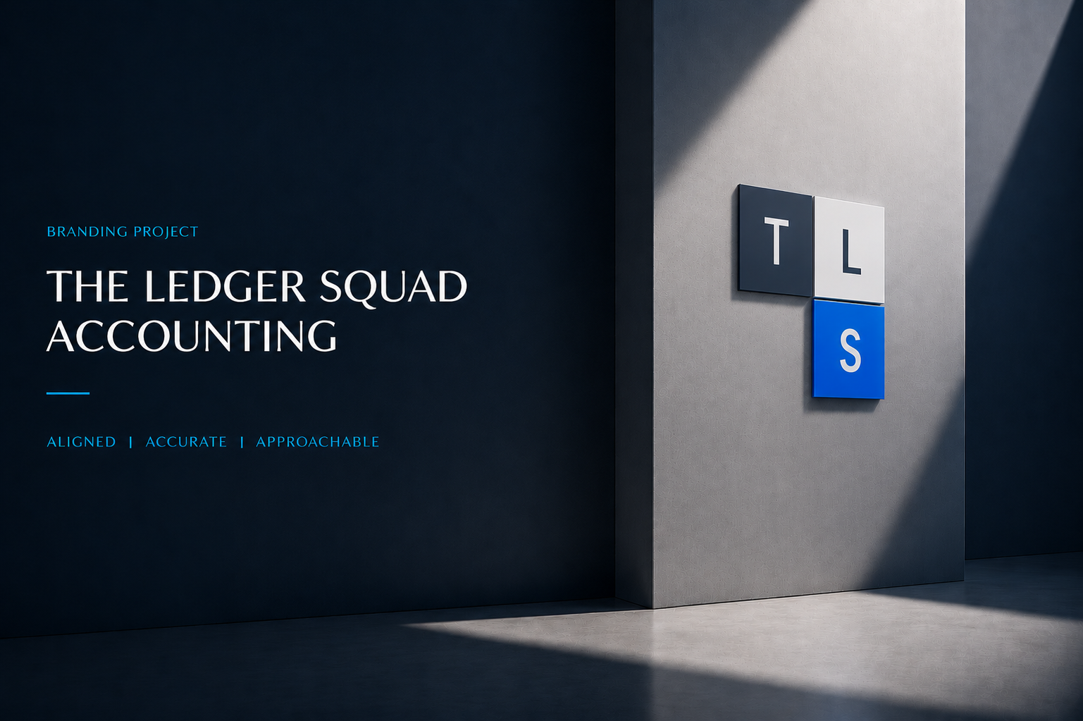
The Ledger Squad is a modern accounting firm based in Ahmedabad, serving businesses across Australia with precision, expertise, and trusted financial advisory. Studio Araj partnered with the firm to create a strategic brand identity that reflects its professional approach, developing a distinctive visual system that communicates structure, confidence, and sustainable business growth.
The Mark
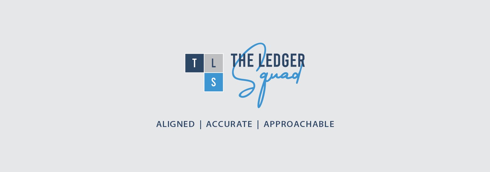
The TLS monogram is built from three geometric blocks inspired by ledgers and financial records, reflecting structure, precision, and trust. Together, the blocks subtly create an upward arrow, a symbol of growth, progress, and financial success.
The bold typography of The Ledger conveys professionalism and confidence, while the handwritten Squad adds a modern, approachable, and collaborative touch, reinforcing the firm's commitment to working closely with clients as a reliable financial partner.
Together, the logo represents a firm that is Aligned, Accurate, and Approachable, helping businesses move upward with clarity and confidence.
Color
The color palette has been carefully selected to communicate the firm's values and personality. Deep Navy Blue represents trust, integrity, professionalism, and financial expertise; Light Blue symbolizes clarity, growth, innovation, and a forward-looking approach; and Grey reflects balance, reliability, neutrality, and sound judgment. Together, these colors create a refined and contemporary identity that reinforces The Ledger Squad's promise of being Aligned, Accurate, and Approachable.
The Idea
The identity leans into the calm of a balanced book: a deep, trustworthy navy, a clean accent blue for moments of energy, and a warm taupe to keep it approachable. The stacked monogram behaves like a seal of accuracy — equally at home on a letterhead, a card, or an envelope flap.
Stationery
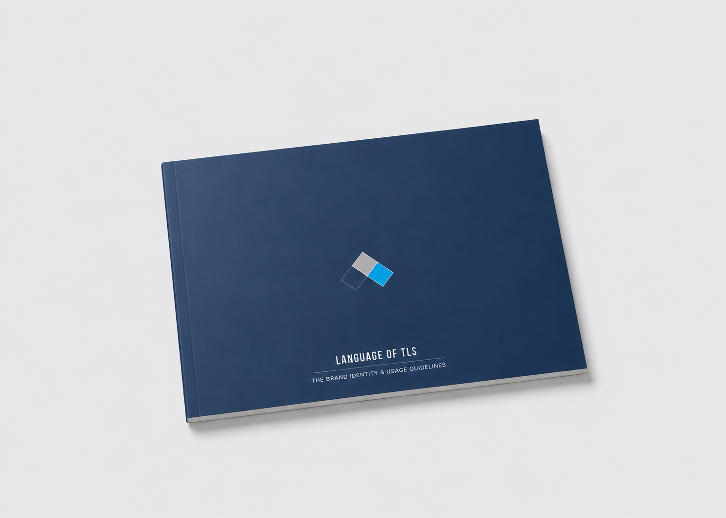
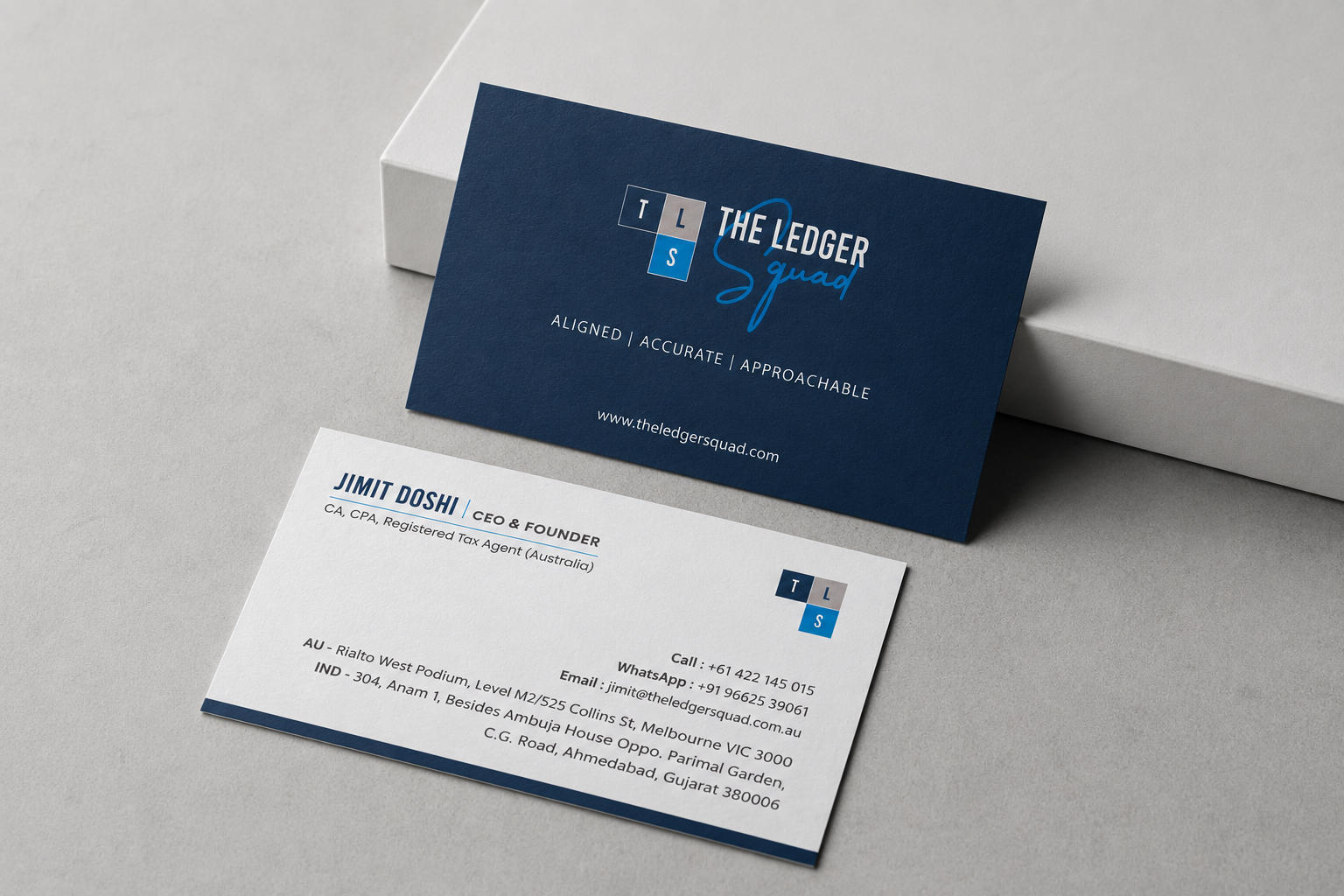
From the guidelines that hold it together to the letter that lands on the desk — one calm, aligned system carried across the full collateral set, guidebook to envelope.
.png)
.png)
.png)