Client
Delmarin is a skincare brand built around the belief that self-care should feel effortless, refined, and contemporary. Guided by its promise, "The Signature of Modern Self-Care," Studio Araj partnered with the brand from its foundation, crafting its name, logo, and complete brand identity. From stationery, including visiting cards, letterheads, and envelopes, to product packaging and a thoughtfully designed product catalogue.
Behind the Logo
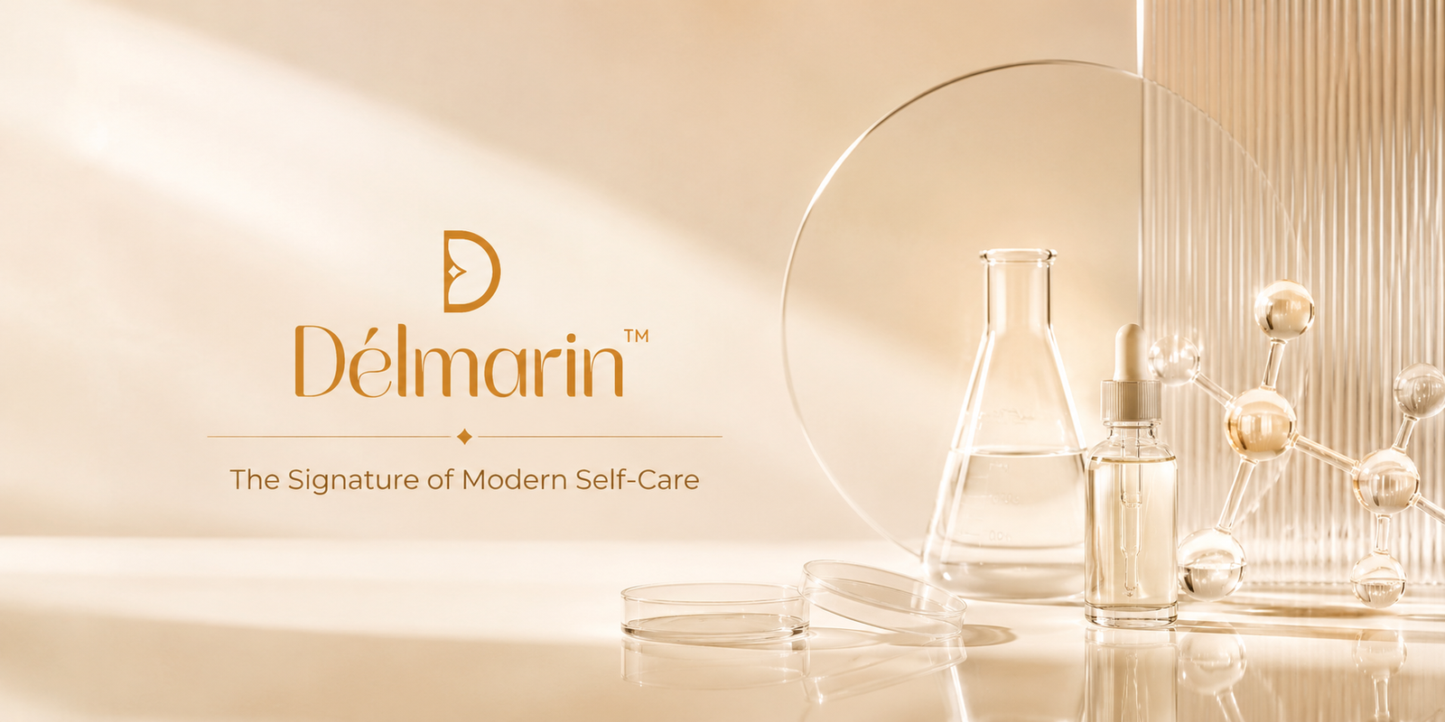
Délmarin's monogram folds a single droplet into the counter of the letter D — one continuous curve meeting one straight stem. The mark reads as both an initial and a symbol of the formulation itself, while the custom wordmark carries the same soft, high-contrast curves in a light, modern serif. Together they express purity, precision and quiet refinement in a single copper form.

Color
A warm, luminous scheme — burnished copper grounded in soft cream and clean white.
Packaging
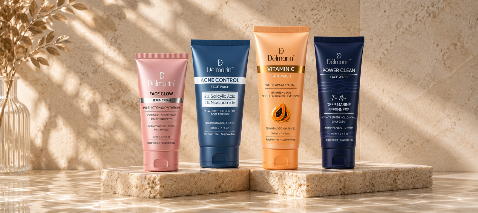
We designed the full tube range — structure, colour coding and on-pack hierarchy — so each variant reads instantly on shelf while holding together as one family.
The Catalogue
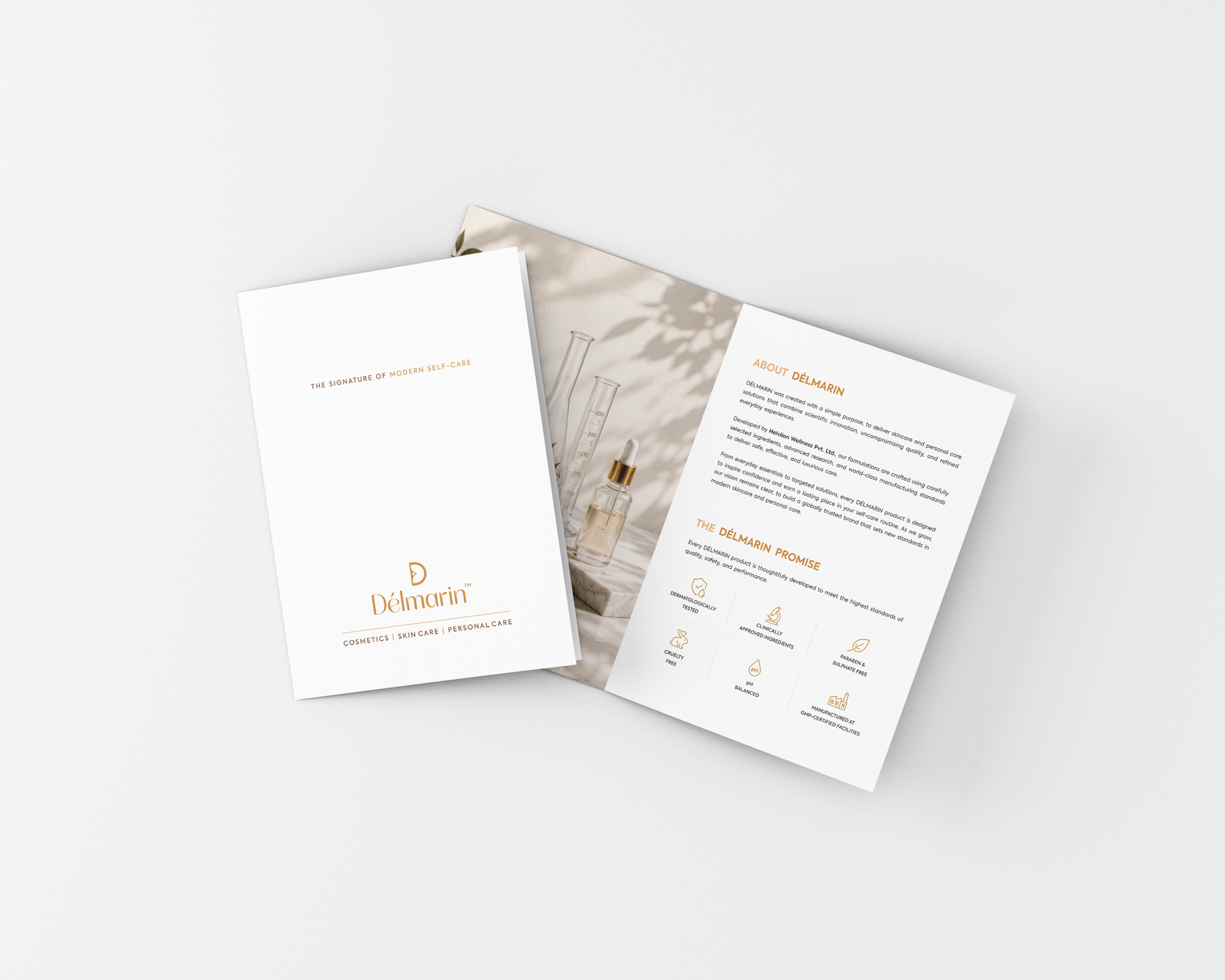
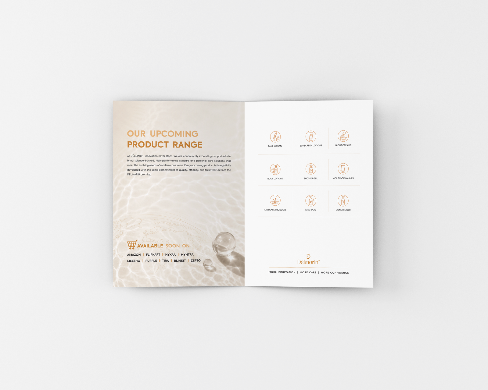
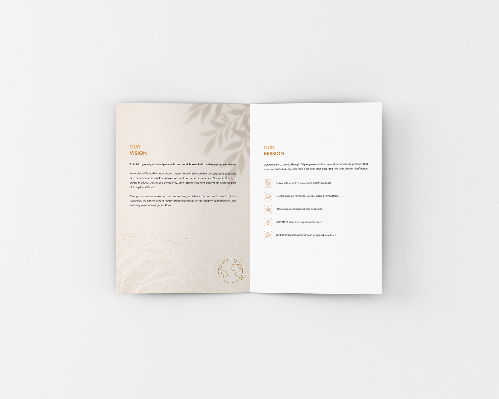
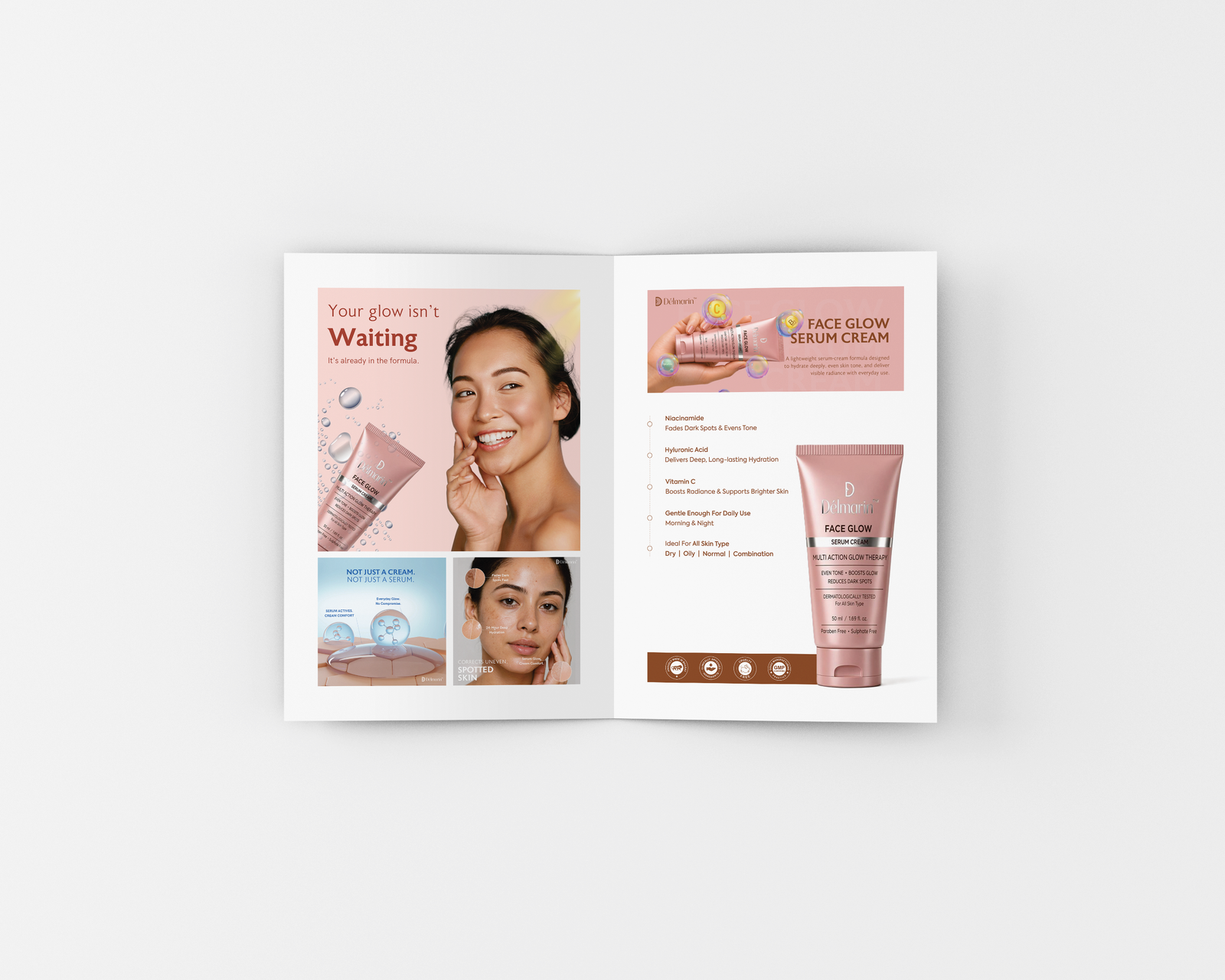
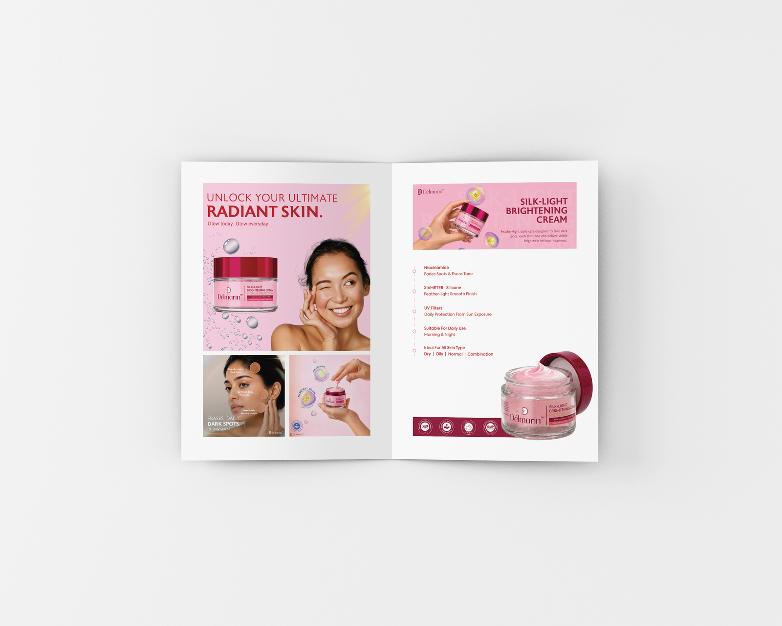
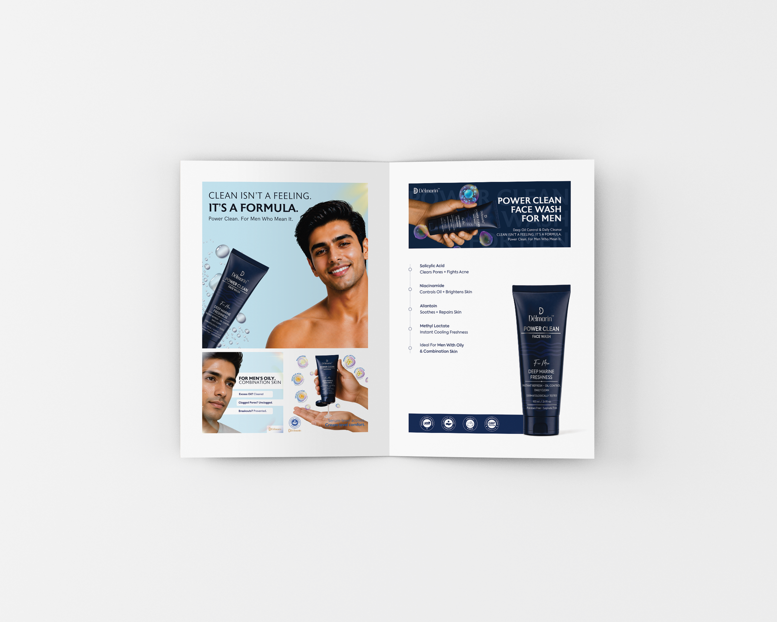
The Délmarin catalogue carries the identity across every spread — an open, airy grid, generous white space and copper accents that let the formulations speak. Each product is introduced through a single hero image, a short promise and the actives behind it, so the brand reads as calmly on paper as it does on the shelf.