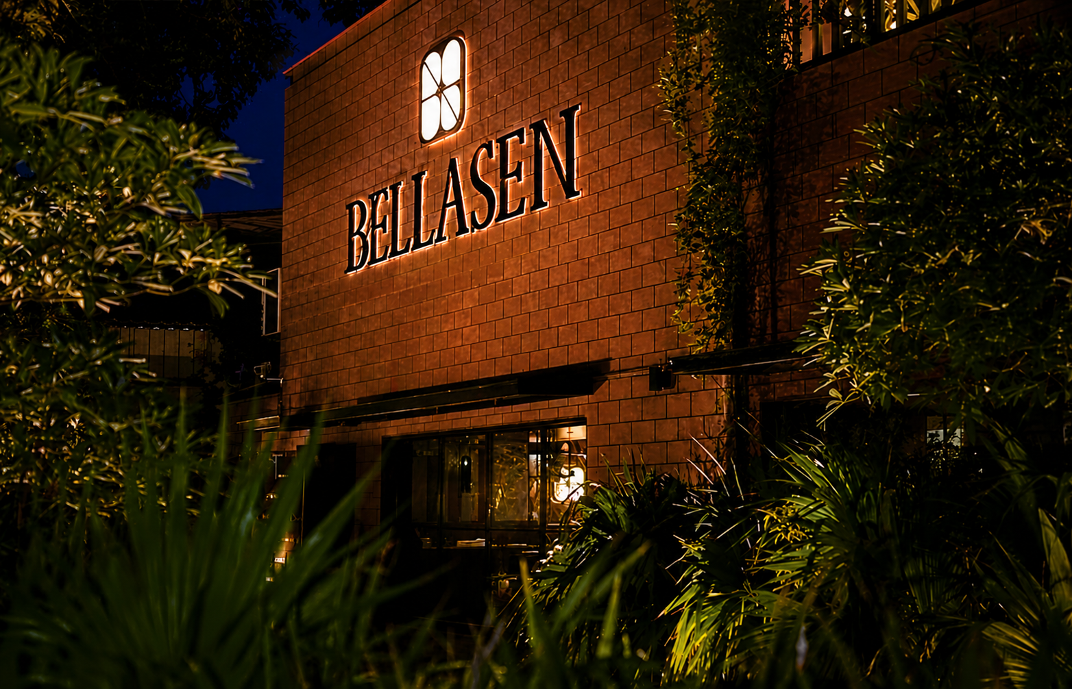
Client
A fine-dining identity built for the table. Bellasen is a restaurant brand located in Ahmedabad, founded on a simple belief, that food is a celebration, an ode to life and to the people you love. We shaped an identity that carries that warmth from the printed menu to every place it is served.
Behind the Logo
Bellasen's identity is derived from a custom geometric monogram contained within a rounded square. The symbol is constructed using a consistent system of curves, straight lines, and negative space that collectively reveal each letter of the word BELLASEN. The result is a refined mark that balances simplicity with depth, expressing the harmony of structure, craftsmanship, and elegance through a single geometric form.

Color
A grounded, warm scheme — charcoal ink and copper-rose, softened by gold and cream.
The Folios
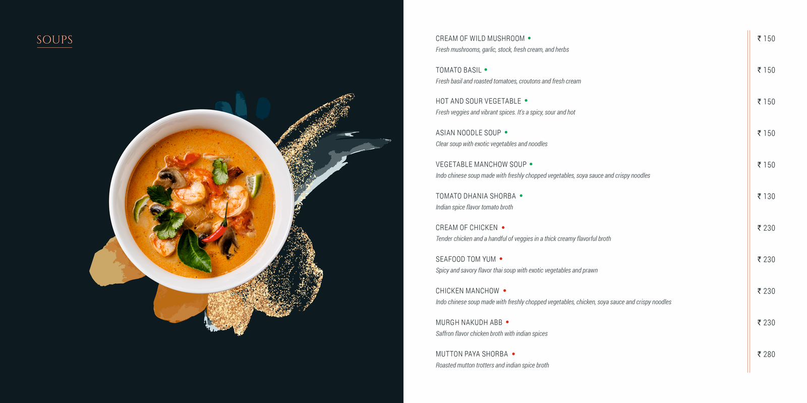
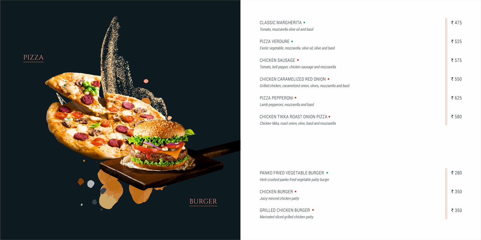
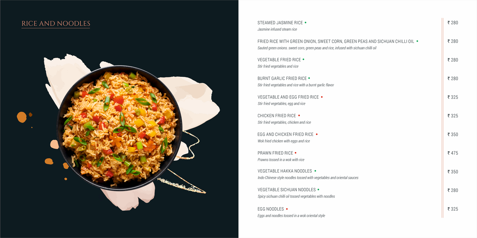
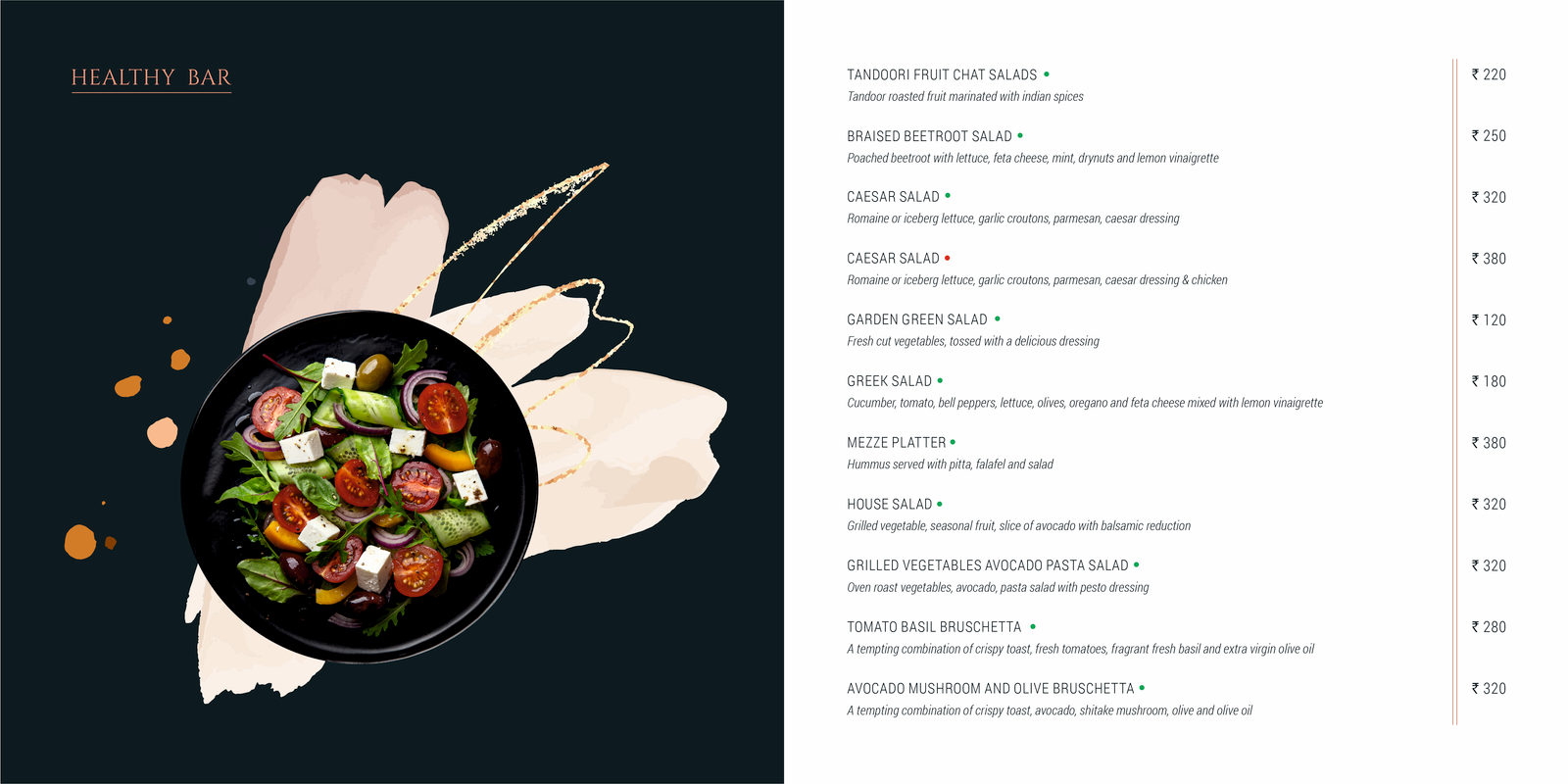
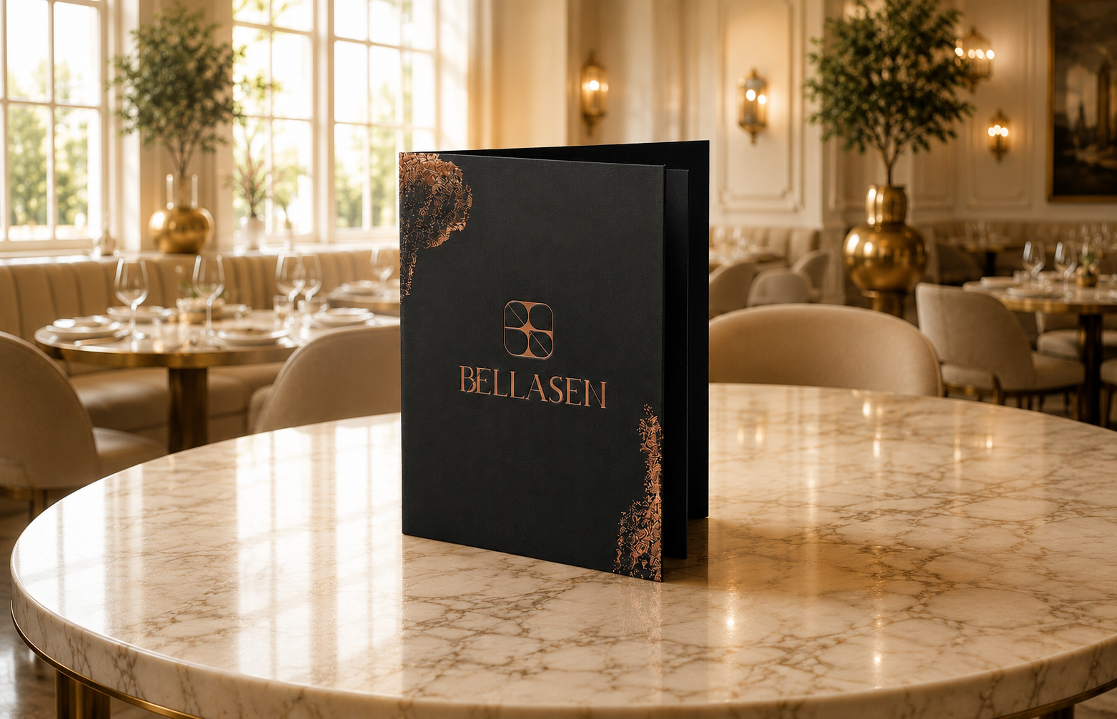
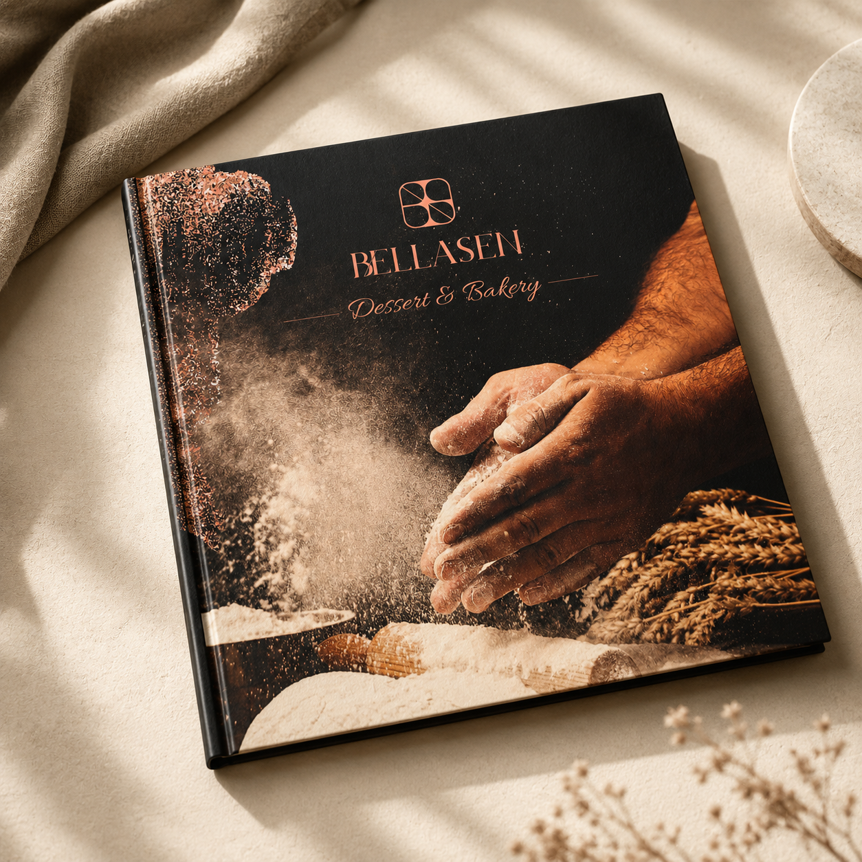
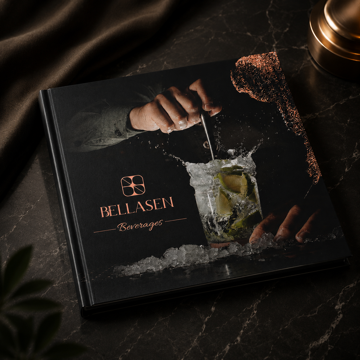
Every dish at Bellasen tells a story, and every page of the menu is designed to bring that story to life. Inspired by the elegance of fine dining and the joy of shared experiences, the menu combines thoughtful design with culinary passion, creating an experience that is as memorable as the food itself.
The Collection
Section dividers and inner spreads — a single, calm atmosphere carried page to page.